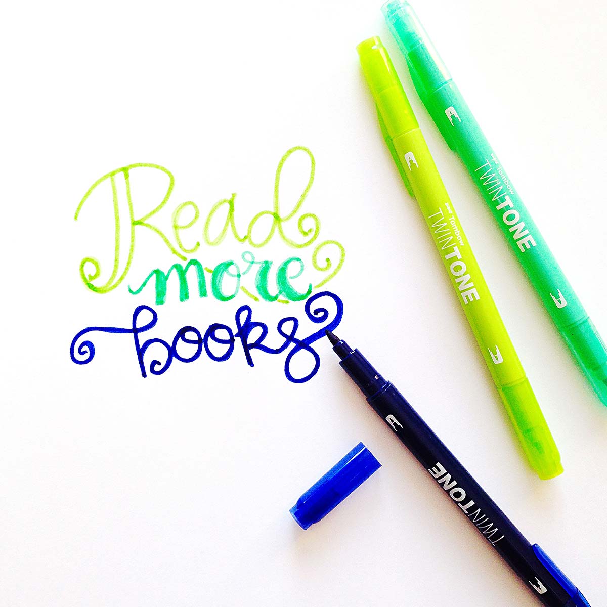
Hello friends! Today I’m sharing a simple hand lettering example and while walking you through the process I’ll help you with some easy tips. Any marker will work for this!

Simple hand lettering is more like a stylized refined version of your own hand writing. Today I’m sharing 5 points to help get you started.
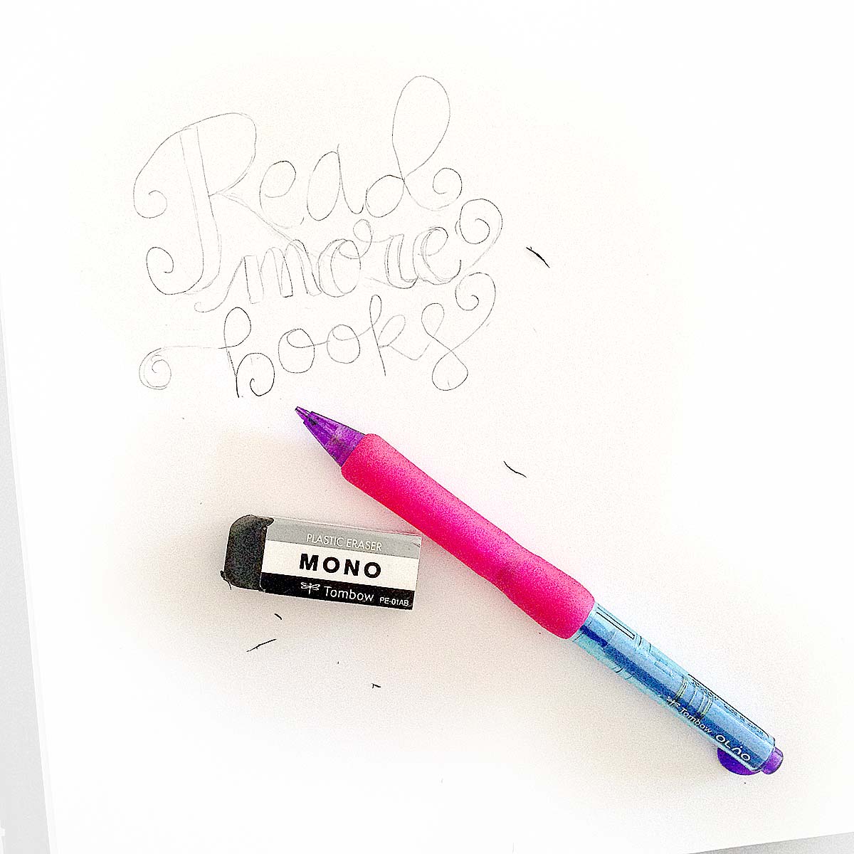
Let’s gather our supplies: You will need a pencil or a mechanical pencil and a good eraser for your sketch work. I love the black eraser by Tombow, it never shows smudge marks! Grab some markers to work with- I am using the Twin Tone Markers today along with some smooth marker friendly paper. You can use a Marker sketchbook or these loose papers – using marker friendly paper helps the marker glide smoothly to create beautiful strokes.
FOLLOW ME: INSTAGRAM, TWITTER, BLOGLOVIN, FACEBOOK, PINTEREST
TIME TO LETTER:
1. Start with a pencil sketch

This might sound redundant, but starting with a pencil sketch is actually very beneficial and saves time. Unlike lettering with a pen or marker, a pencil lets you erase your mistakes and also lets you plan how you wish to overlap any alphabets. Even a quick sketch can help you estimate the spacing between your letters.
For today’s simple hand lettering, I took my time and made a quite detailed pencil sketch. I like to use a mechanical pencil while on the go and I tend to add simple loops at the end of my words.
2. Mix and match font styles

Lettering is all about treating alphabets as pieces of art. Each alphabet has its own distinct feature and the way you arrange the alphabets together is basically what hand lettering is all about. If you think about it, this is something you have been doing all your life with your handwriting, but now you can intentionally place letters together artistically.
In the above example- the words ‘Read’ and ‘books’ are lettered in what I call ‘dramatic cursive’ but is actually known as monoline lettering. The upstrokes and downstrokes are all just a line and not weighted.
What does weighted mean? See the word “more” above, that has a weighted font. I have made certain parts of each letter thicker by adding an extra outline. That is faux calligraphy. I add a thicker area for the downstrokes but the upstrokes still remain the same.
Also, the first letter of the word ‘Read” has a slightly fancier start- I used a drop cap font style. You usually see this kind of font at the beginning of a new chapter in storybooks. I thought it fit appropriately here.
By mixing and matching different fonts you add more interest and character to your lettering.
3. Make it colorful
As a beginner, even if your font lines are shaky there is one thing that you can use to your benefit. Color. Mix and match your marker colors to choose unique color combinations to make your final lettering stand out. If you are daunted by color, use pre-chosen color packs- like this Bright Twin Tone pack to solve your problem. All the markers in the set are chosen to complement each other already.

4. Find your own style
As you progress in your hand lettering journey, your style will start to evolve. Whether you like it or want it you already have a lettering style ingrained in you and the faster you embrace it, the more fun you will have. Just like your handwriting or fingerprints your lettering style is unique to you. You will probably start off by copying and imitating examples of what you see on the internet and that is totally fine. Practicing by copying is no crime. Just give credit where credit is due – say something like “I was totally inspired by ….” or “design credit goes to…” and please don’t sell something that you copied.
After practicing a while, you will get an itch to try something new of your own. This might be heavily influenced by what you have practiced but it will slowly evolve to become something that represents you and that my friends become your style.
5. Keep practicing your simple hand lettering
The more you practice the better you get. The more you practice, the more you will learn what won’t work. Make mistakes, erase lines and get frustrated. That’s all part of the learning. But don’t give up, continue to letter and you will slowly learn from those mistakes. I have been lettering for just over 2 years now and when I sit down to letter now I never know what I will get. I might create something I absolutely love or something that I end up crumpling up and throwing into the trash. Either way, just spending time lettering is my way of relaxing and releasing stress.
Interested in more Lettering tutorials? Click here to see all of my Hand lettering posts.
Let me know in the comments below how you plan to use your simple hand lettering? Will you be fancying up your holiday cards, notebooks or planners? Where do you plan to letter next?


